
Pattern Play in the Dining Room
This past month my dining room received a makeover. It all started with the wallpaper. I rarely buy something on a whim, but that’s exactly what happened with this paper. The colors just looked too perfect, so I took a risk.

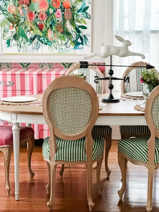
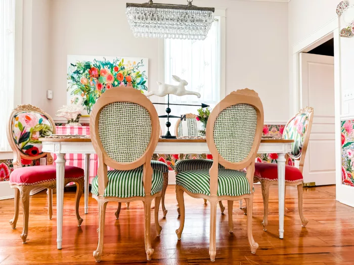
I thought it would be perfect below the chair rail for my dining room. But I knew if I did this, I would probably have to redo my chairs to make it work. I’ve had these chairs almost 2 years in my space, upholstered with fabric from Carrie Schmitt’s art mixed with checks. So, it was time for a makeover in this space.

Once the wallpaper arrived, I began brainstorming all the fabrics I could use on my chairs. There were so many great choices.
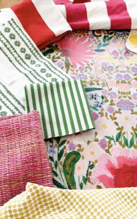
I had to treat this wallpaper like the hero fabric in the room. It was the busiest and the other fabrics needed to compliment it. I noticed one of the Carrie Schmitt chairs actually worked with the wallpaper, so I made another one and these two became the end chairs at my table.

I considered doing all 4 of the other chairs in something different…perhaps each one in a color from the wallpaper. But what ended up making more sense was to go with a neutral…but not the type of neutral you would think. I chose to go all green on the chairs.
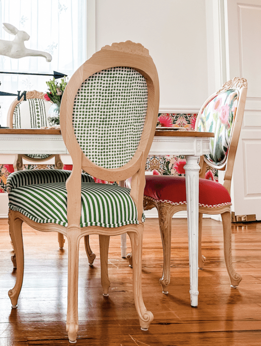
I used a block print geometric fabric on the top front (Thibaut New Haven Stripe), a block print dot on the backside (Molly Mahon Seed), and a narrow stripe on the seat (Kate Spade Picnic Green). The stripe, dot, and geometric added more whimsy to the space but acted like a neutral against all the color.
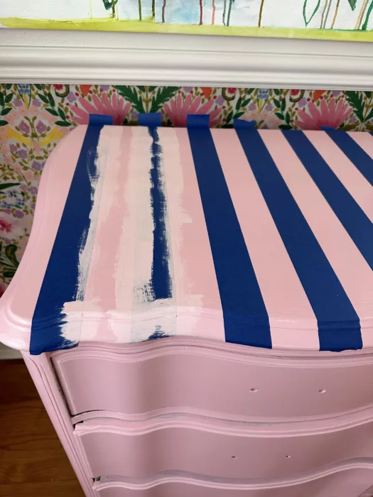
My dresser that I got on Craigslist more than 15 years ago also got a makeover. The white was just too bland. I also swapped Carrie’s art from my living room to my dining room because the colors worked much better.
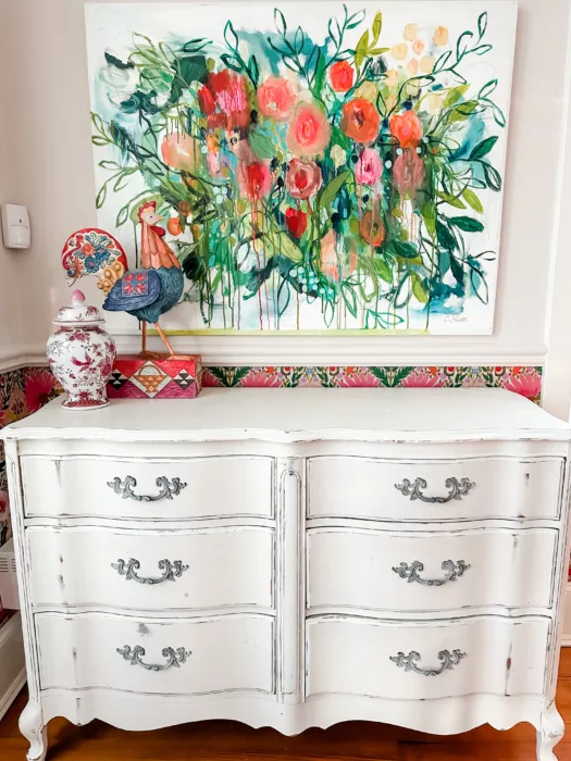
I used the colors from the wallpaper to choose the paint, and I wanted to do a wide stripe on the dresser. Azalea Flower and Tuberose from Sherwin Williams worked perfectly with the color scheme.
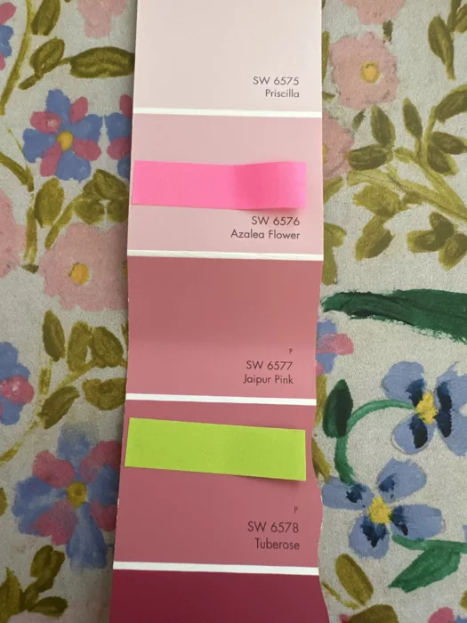
I stared with the lighter color and painted the dresser. Then, I used painter’s tape. (But I should have used Frog Tape. The blue painter’s tape did end up taking off some of the lighter paint when I removed it.) To get a crisp line, I painted the lighter color on top of the edge of the tape. Then, I painted the darker color on top of that. It took 2 coats of the darker color, and on the final coat, I removed the tape when the paint was still wet.
It turned out really cute.

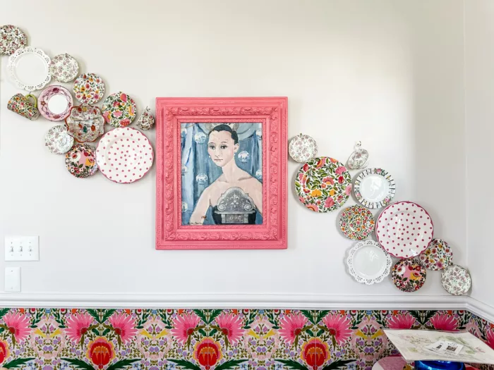
Then I took a look at my plate wall and made a few adjustments with the plates.
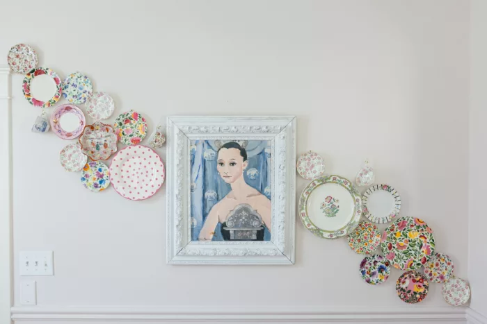
I also painted the frame of the picture with the darker paint to tie into the color scheme.
The entire room began coming together.

How adorable is this??? From Carrie’s art to the various fabrics and striped dresser, it all works together. I’m so glad I took the risk and went with that wallpaper. You can see a full tour of this space on my YouTube channel (click here).
Sometimes risks are worth taking, and boy am I glad I did in this room! My book, Life Whimsy: How to Think, Play, & Work More Creatively talks about taking risks and the huge payoff we often get when we do. You can preorder your copy by clicking here. I hope it gives you the courage to take those small risks, too.

Check out my online courses to spark your creativity and upgrade your joy, starting today!


10 Best Statement-Making Fabrics from Spoonflower