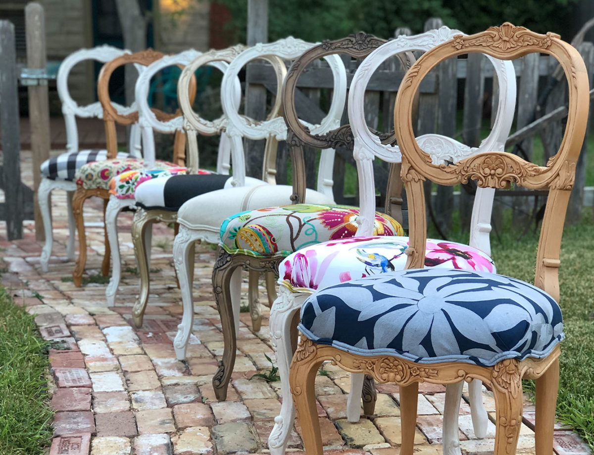
Looking for Design in all the Right Places
Sometimes when I’m least expecting it, I see a color combination that takes my breath away. Gold layered on white (with a little navy, of course)…
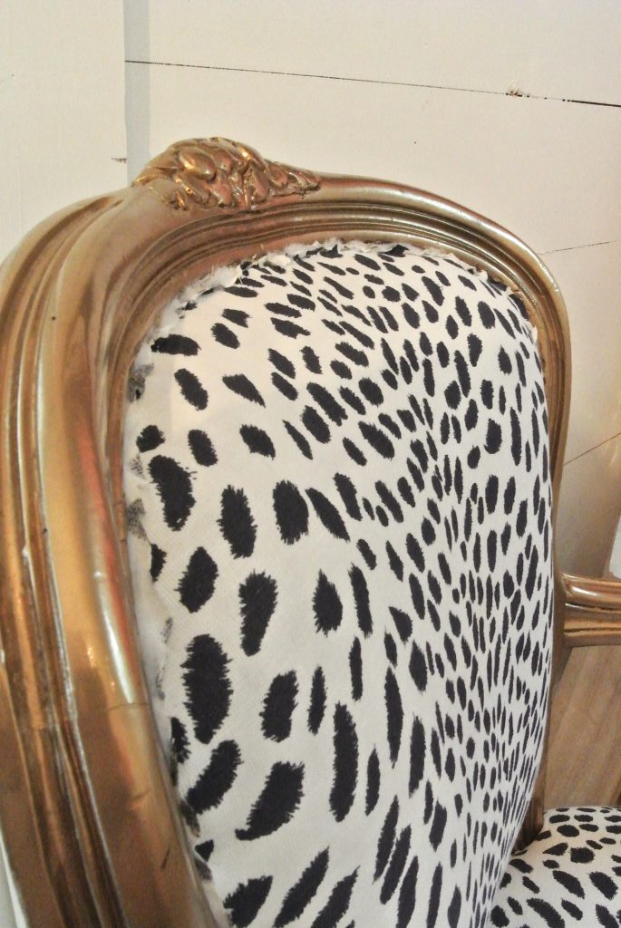
While designing my studio this year, I was tempted to go with a feature wall using different colored wood. At the last minute I decided against it and went all white. Now, I’m glad I did. White is the perfect backdrop for the colorful chairs that rotate through my studio on a weekly basis.
Just last night as I was working on a cowhide for a client, I caught a beautiful glimpse of this chair that is almost complete (except for the missing double welt cord trim). I had put to the side so that I could get another chair started. There it quietly sat, and as I scanned the room taking stock of the mess I had made throughout the day, I thought, “Wow, that looks awesome together!”
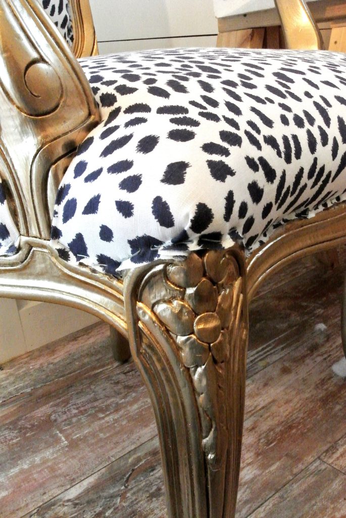
A local client had commissioned this piece, which I painted gold. I love leopard print and had seen this navy print more than a year ago. (It comes in green and red too!)
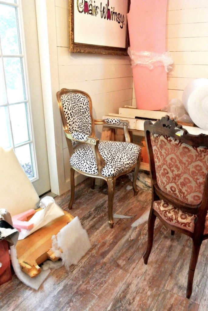
The white wall allows it to be the star of the show. It’s crisp, clean, and fun—just what the client ordered! Good design is all around us, even in the midst of our mess.
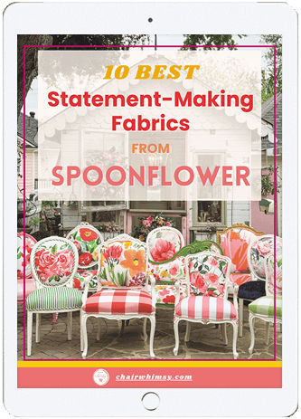

10 Best Statement-Making Fabrics from Spoonflower
