How I Collaborated with a Big Brand
On a sunny weekday afternoon in May, I slipped into my favorite Frances Valentine dress and headed to their local trunk show here in Austin. Already a fan of the brand, my goal was to meet CEO and brand Co-Founder Elyce Arons, whose creative vision and leadership also inspired me. When I did meet Elyce, I said, “Your clothes look like my chairs!” and showed her some of my work. After that, we chatted a bit, and she followed me on Instagram. A month later, I reached out to her to ask if she would participate in my Creating With Color Summit.
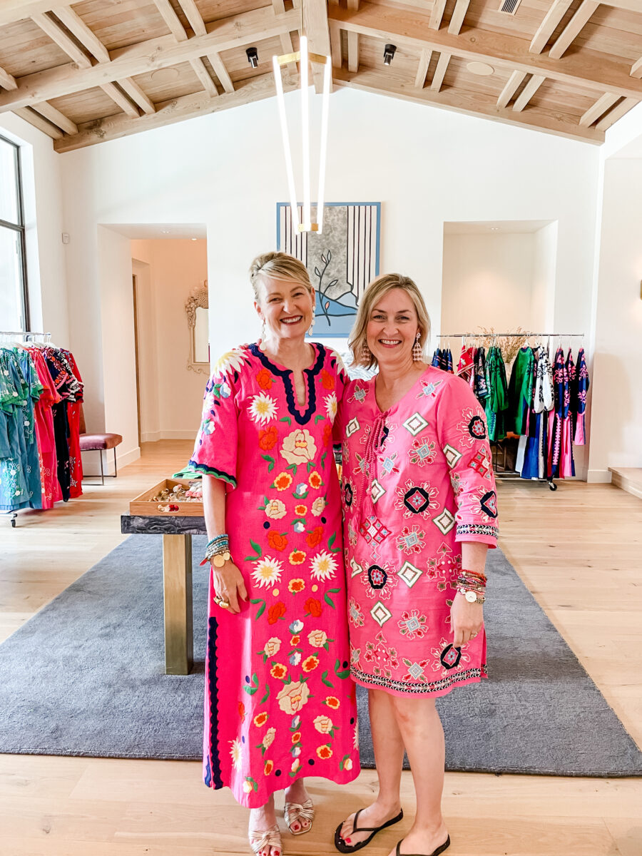
I felt like it was a long shot, but she said yes, and I was thrilled to have her on board. Shortly after the release of the Summit in October, Elyce sent me an email pitching a collaboration of my chairs with Frances Valentine fabrics. My answer was “yes,” and just a Zoom call later – we were officially on for this project! (You can check out more of Frances Valentine Home items by clicking here!)
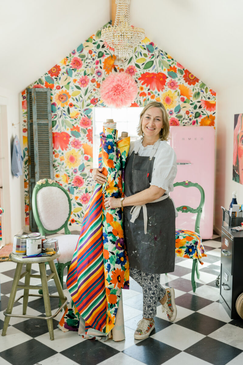
During our Zoom call, I was delighted to see that Elyce has a brainstorm wall where all the collection fabrics hang before each season begins. It’s what I also do in my studio. Frances Valentine’s creative director, Elyce, and I all agreed on this amazing combination of a floral and a stripe…in different sizes of big and bigger so I could mix and match them in a variety of ways.
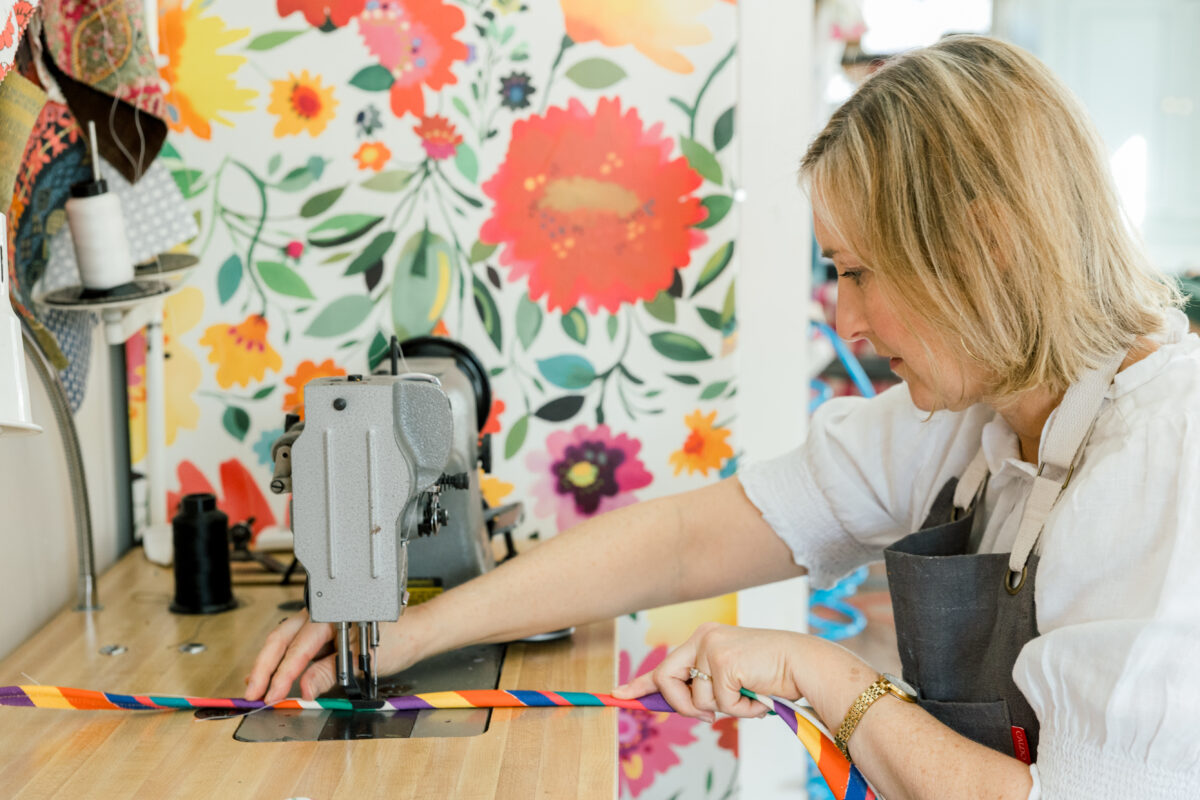
The fabric was ordered and I waited with anticipation. Elyce had expressed that she would love to see a painted chair, the only question was, what color? I can never decide on what to do until I have fabrics in my hands. I need to physically see it to put ideas together. It’s a messy process at first, but over several days the design eventually emerges.
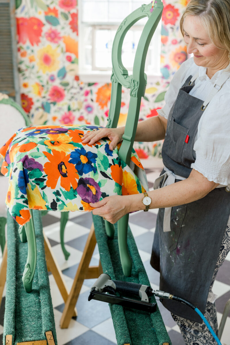
I had initially thought about adding another fabric in the mix. I wanted to add a pink fabric, my signature color. But the struggle was too much and caused me a lot of frustration. It would have worked with the stripe, but not the floral. When I finally let go of that idea and embraced what was in front of me, the design came together. The chairs would definitely be “Chair Whimsy,” but they would also represent Frances Valentine…a perfect collaboration.
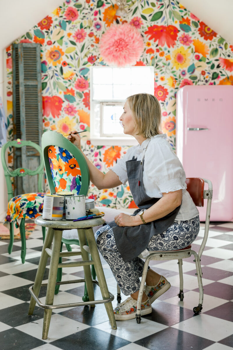
With fabrics in hand, the choice to go with a bold green paint was the obvious one. I settled on Amy Howard’s Easy Street because it matched both fabrics perfectly! Then, I embellished the flower carvings on the top of the chair with yellow, orange, and purple to add a little pizzaz.
I have always embraced hand-painted chairs. It takes a lot of time and care compared to spraying chairs—but feels more carefully crafted and unique. Adding embellishments was the ultimate treat to these chairs, making them extra special and hand-crafted.
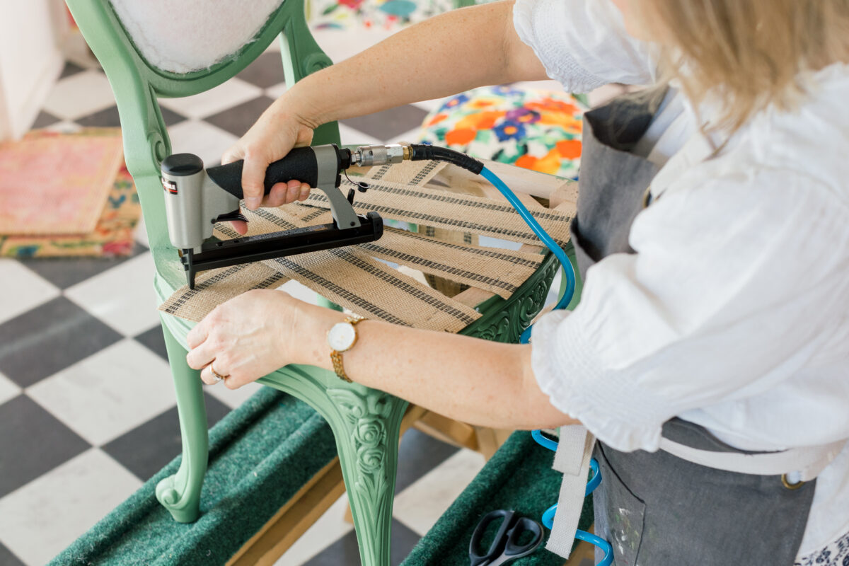
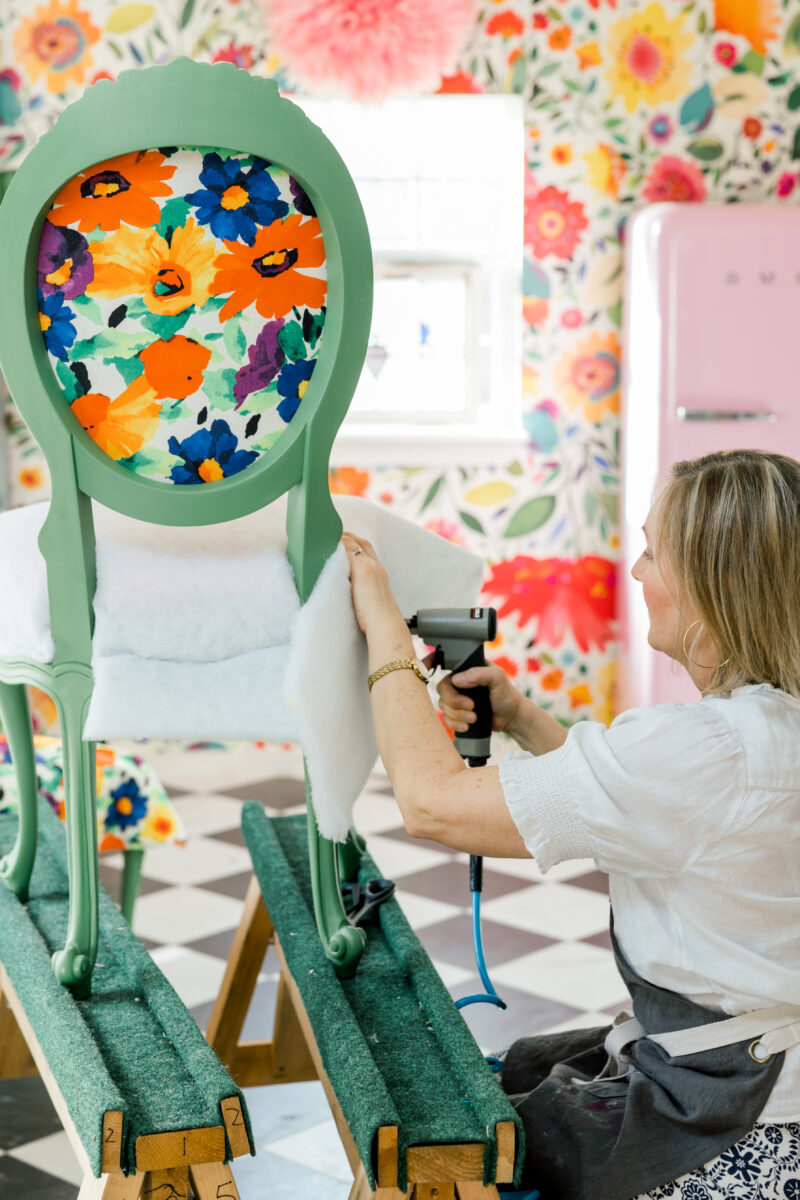
I chose two different chair frames: one oval and another balloon back, both inspired by Victorian furniture from ages ago. I enjoy the process of upholstery. The building of the seat, the layering of jute, burlap, cotton, foam, and dacron.
The photoshoot took place on a sunny morning in February at Woodbine Mansion in my neighborhood, an old house that dates back to 1895. This venue is popular for parties, weddings, corporate events, and you guessed it, photoshoots!
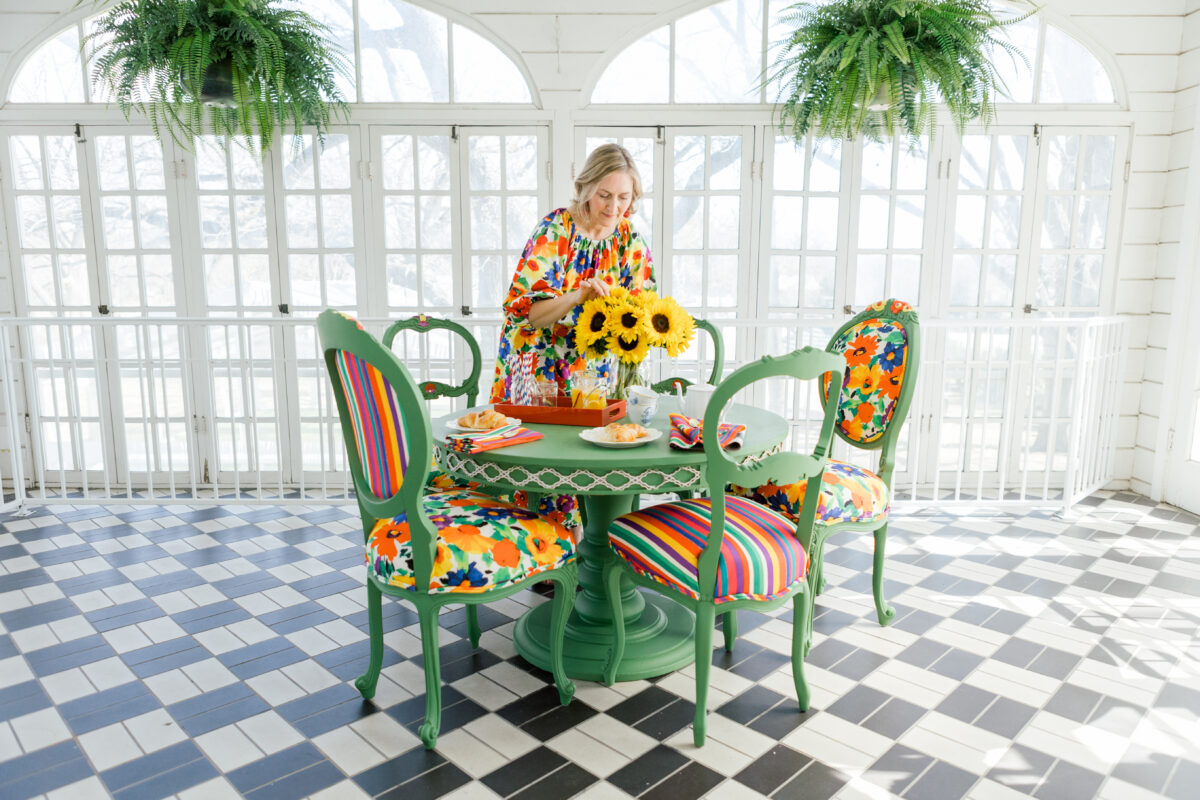
Who wouldn’t enjoy a breakfast in the sunroom? I knew I wanted to shoot in the mansion’s sunroom with its black and white floors and wall of windows…perfect for pattern mixing with my stripes and florals! I used both styles of chairs in here to create interest. It works because the chairs are painted the same color.
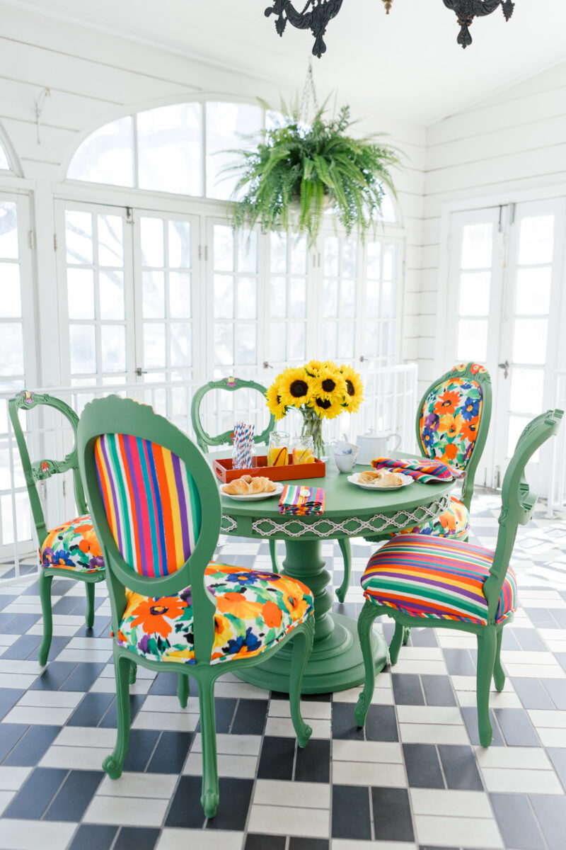
To create a breakfast room, I knew I needed a round table (instead of a long dining table). I found this table on Marketplace for $30, painted the detailing white and the table green to match the chairs. The green paint and white detailing stands out with the black and white floors while also blending in with the chairs and bright fabrics.
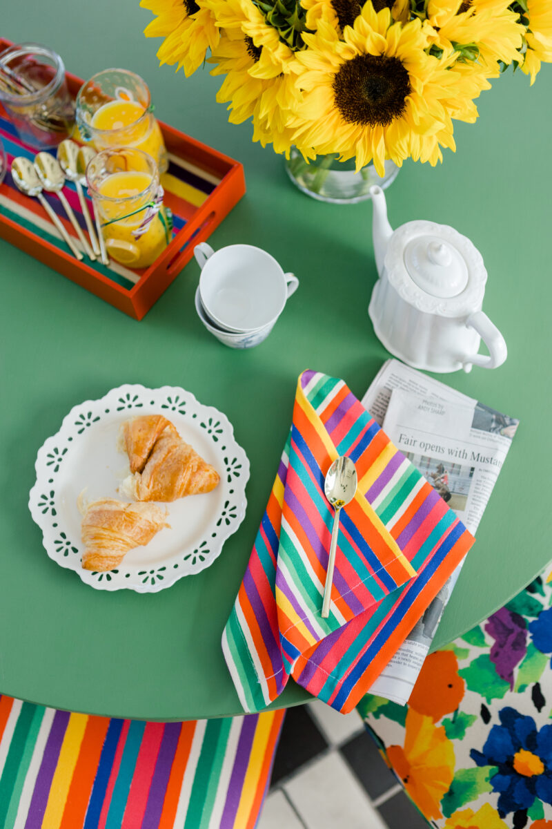
To style a breakfast table…think about what foods people eat for breakfast. We chose to represent this meal with croissants, orange juice, and tea/coffee. We used a tray to break up the table space, unfolded napkins, and a newspaper. The sunflowers stand out and draw the eye to the yellow in the fabrics.
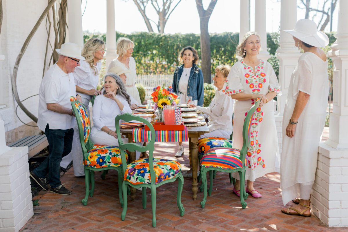
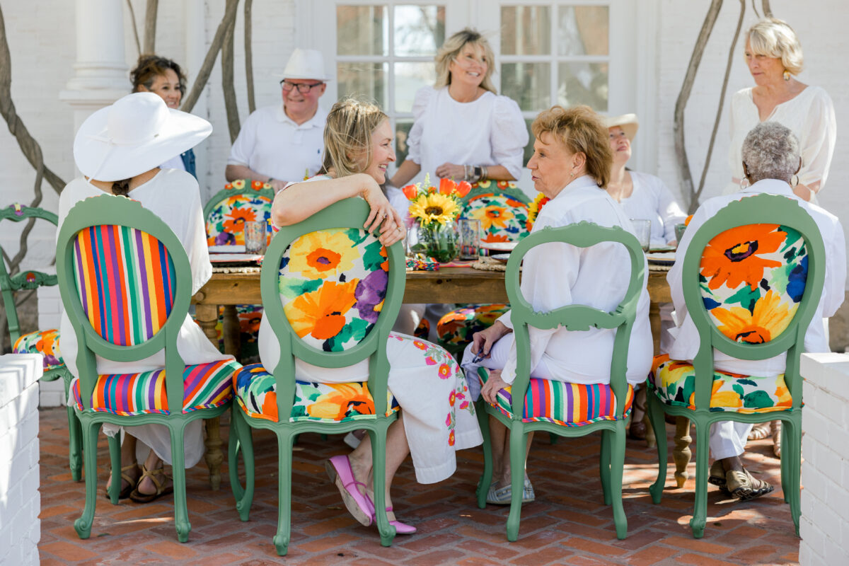
To get some great lifestyle shots, I enlisted friends and neighbors who agreed to wear white, show up, and have some fun! Trust me, no one misses the chance to hang out at the neighborhood mansion.
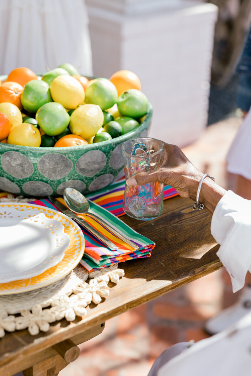
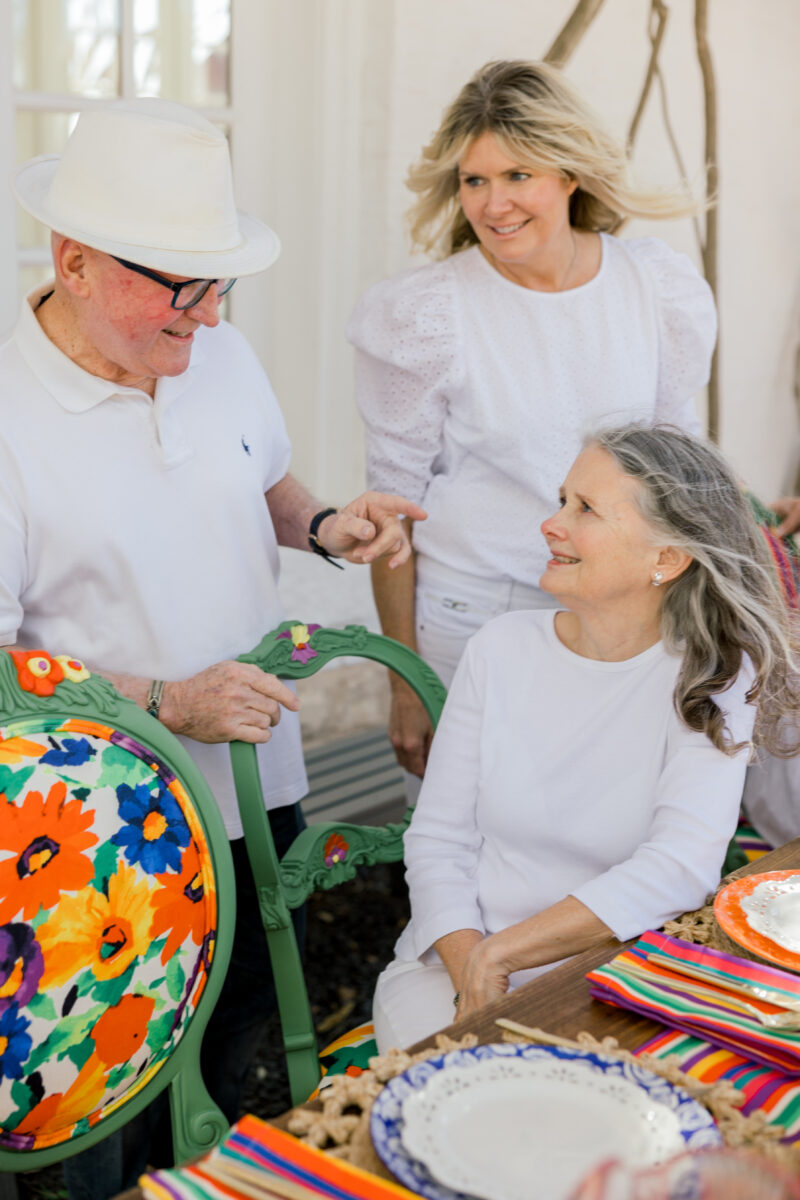
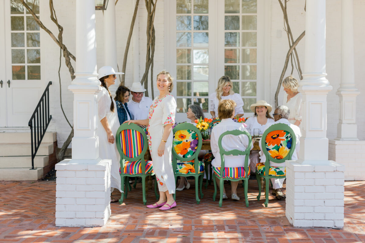
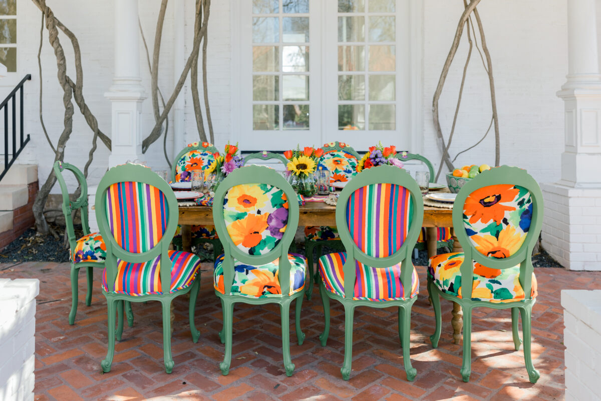
One goal of this shoot was to show how these chairs work with a variety of tables and settings. For the outdoor shoot, I chose a farmhouse table mixed with all the chairs in the collection.
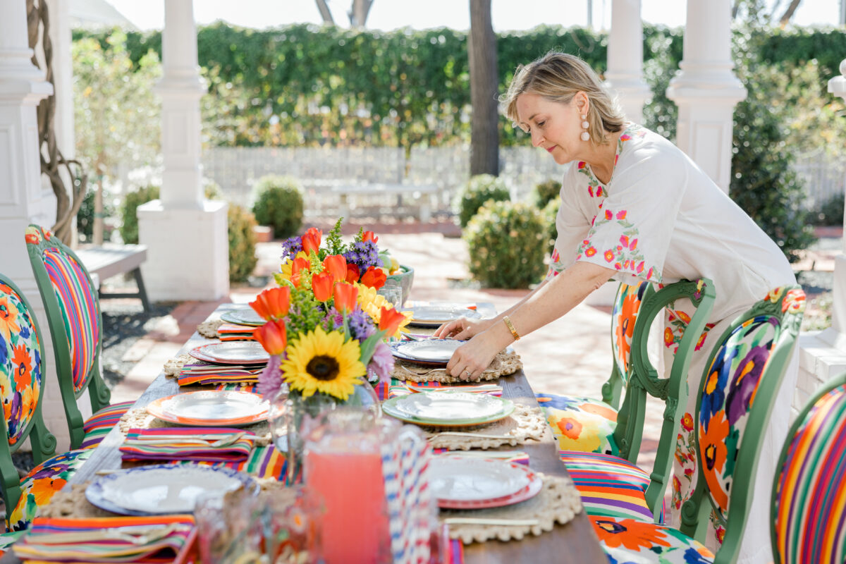
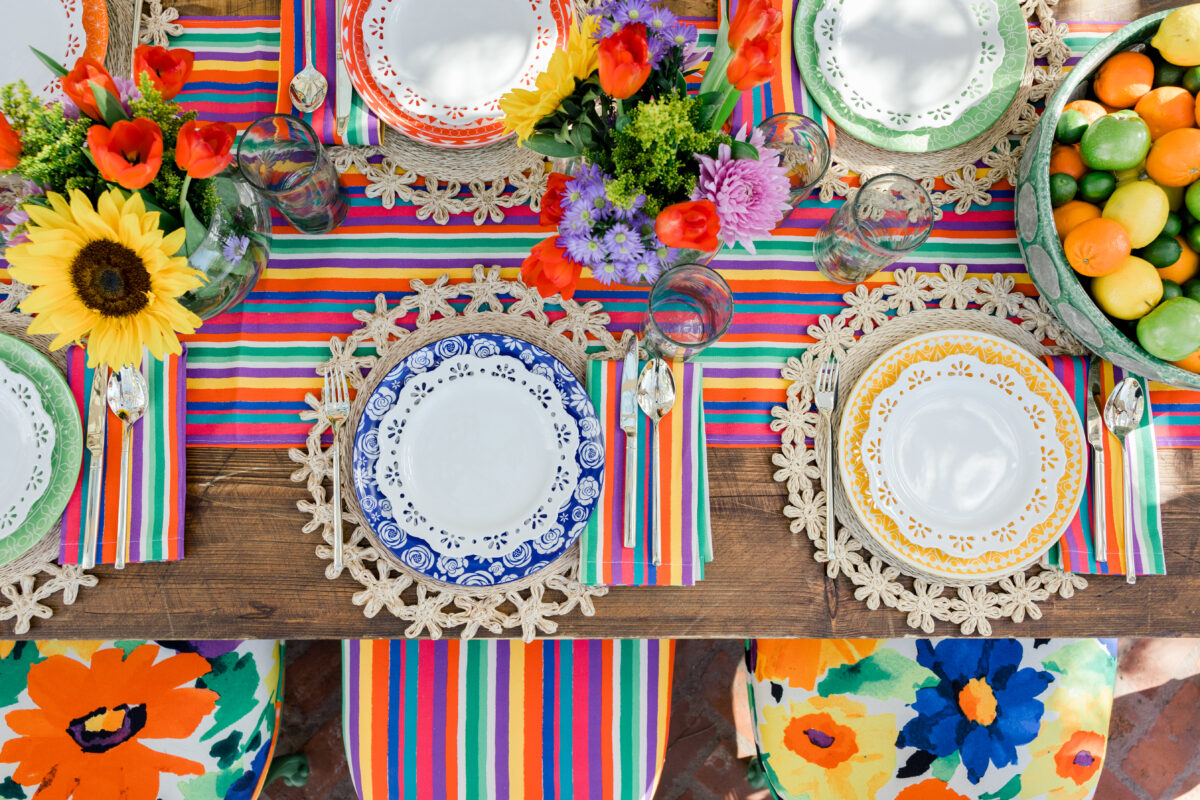
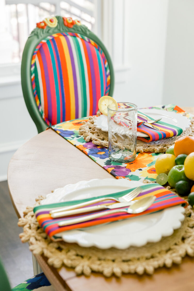
The striped Frances Valentine runner and napkins were layered under woven placemats, colorful dishes, white plates, and gold flatware. The flowers were a mixture of tulips, asters, sunflowers, and mums among others.
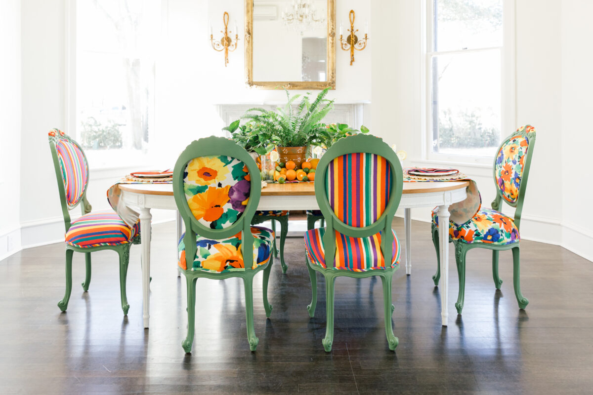
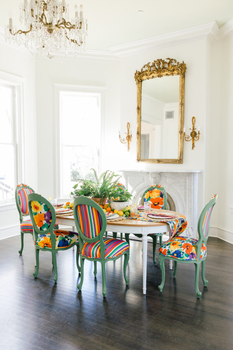
The dining room was the perfect place to prove that painted chairs can work in a sophisticated setting.
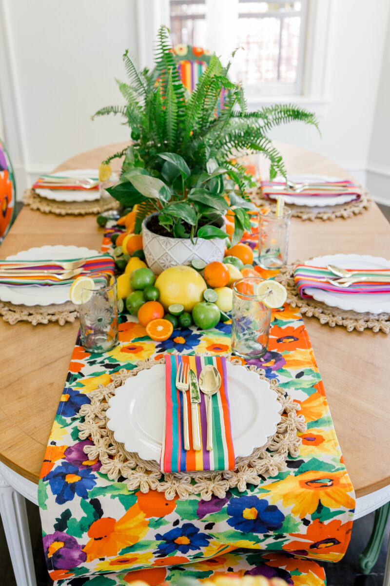
A classic French table paired with the fully upholstered chairs in both florals and stripe adds a bit of whimsy to keep the formal space from looking too stuffy. White walls allow the color to be the star in this space…no other decor is necessary.
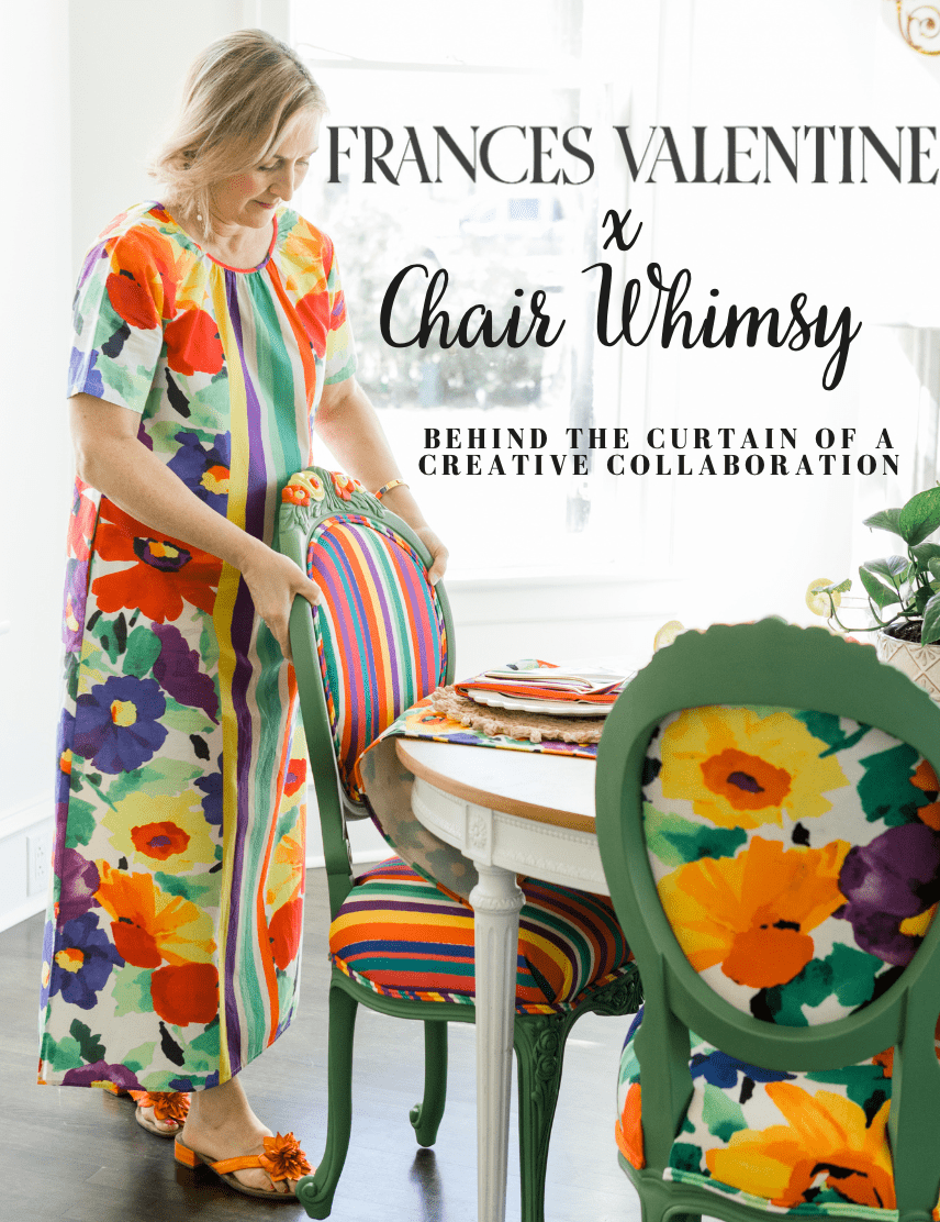
If you get inspired by hearing about this, you’ll definitely love my behind-the-scenes Free Magazine that tells more about it. You can download it by clicking here.
And you can also watch my latest YouTube episode about this collaboration by clicking here. And last but not least, you can check out these chairs right here.
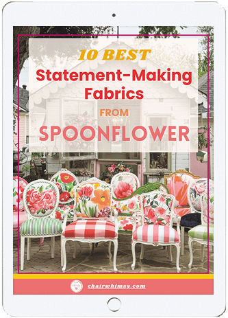

10 Best Statement-Making Fabrics from Spoonflower
