The Screened-In Porch Reveal: How an Antique Quilt Inspired My Most Colorful Space Yet
It started with a quilt.
Back in April, I wandered into an antique store the way I always do — without a plan and with too much hope. And there it was: an old quilt in the most unexpected combination of orange, blue, and red. I stood there staring at it, turning it over in my mind, thinking about the screened-in porch we were building at the cabin. Could I pull those colors together? Could I make orange, red, and blue feel joyful instead of jarring?
I took a picture of the quilt and drove home with a whole color scheme in my head.
Fast-forward to now — and I can tell you that the answer is yes. Emphatically, whimsically, absolutely yes.
A Month of Chaos and Color
Getting this porch finished was no small thing. The construction, the painting, the screening — it was weeks of mess before I could even begin the fun part. But once the walls went up in that gorgeous navy and the ceiling got its coat of fun blue, I knew exactly what I was working with. A blank canvas with really good bones. (see the previous post here)
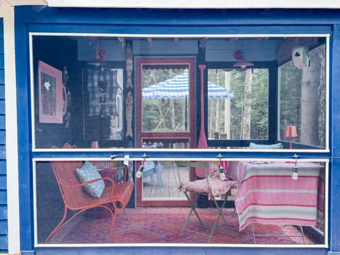
Now I spend almost every day out there. Hours of painting, reading, just sitting in the quiet of the trees. It has become my favorite place at the cabin, and that is saying something.
Let me walk you through every detail.
The Rug That Started It All (After the Quilt)
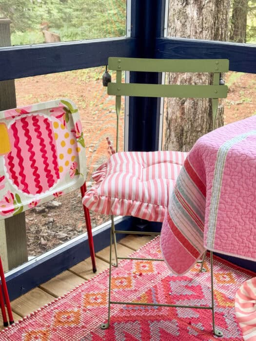
If the antique quilt was the inspiration, the Annie Selke rug was the confirmation. The moment I unrolled it on the porch floor, I knew I had made the right call on the color palette. It is woven in the most beautiful mix of red, pink, orange, and blue (and a small bit of yellow)— bright enough to hold its own against the navy walls but grounded enough that everything else could play off of it.
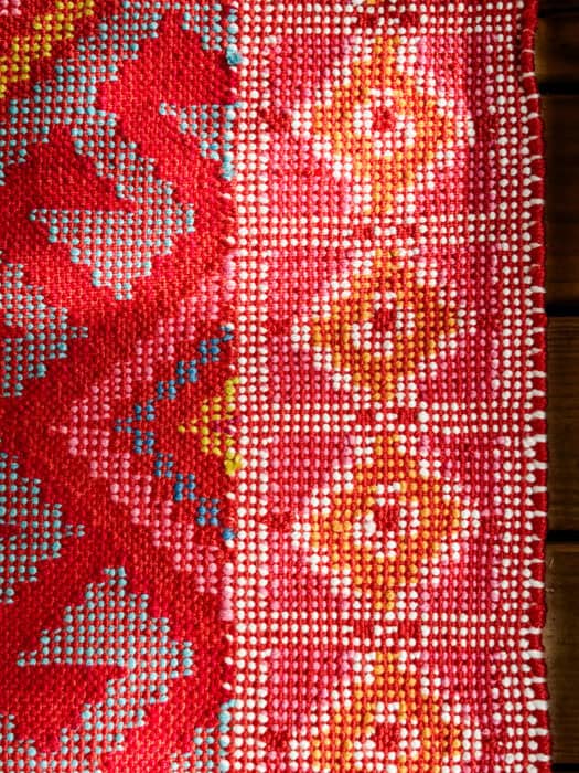
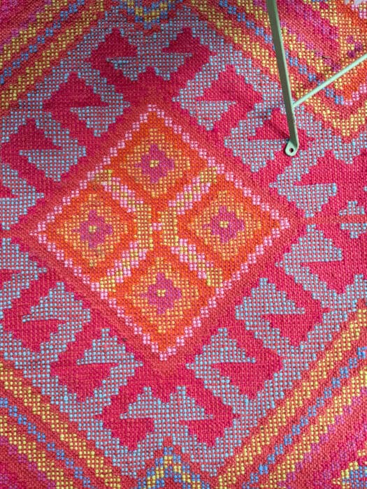
I cannot stress this enough: the rug is the anchor. Everything else built outward from there.
Link: Annie Selke rug
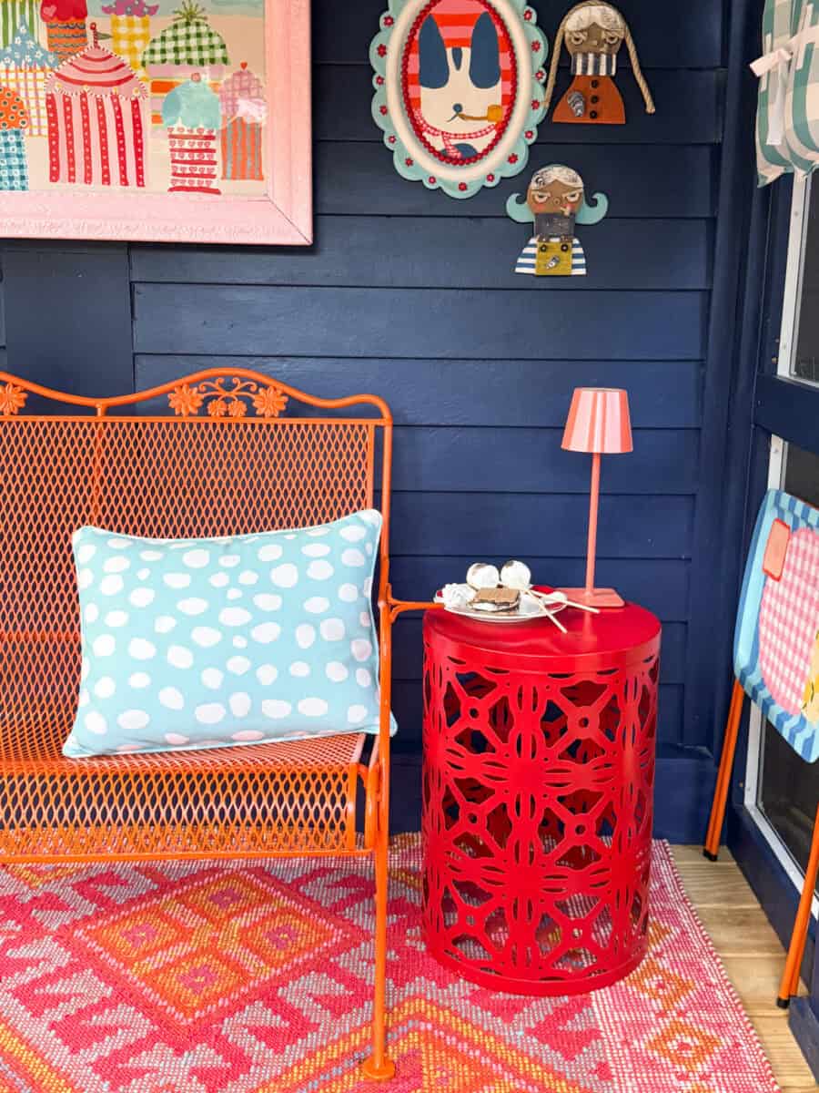
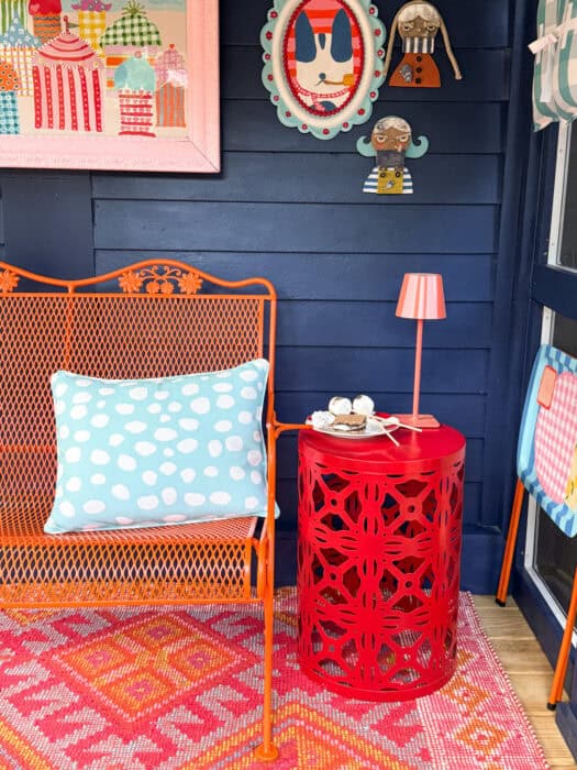
The Bench My Parents Gave Me, Finally Finding Its Place
Years ago, my parents gave me a wrought iron bench — the old-fashioned kind with scrolled details and a latticed seat. It traveled with me from Texas, moved from porch to porch, and never quite had a moment to shine. This was its moment.
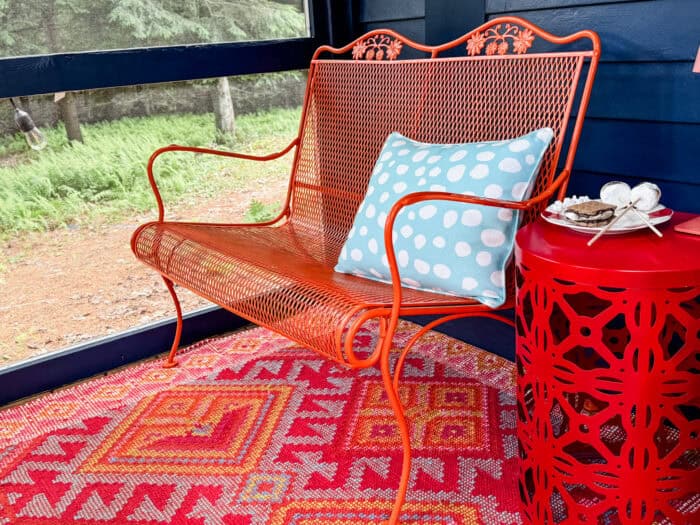
I painted it orange. A full, committed, not-apologizing-for-it orange. Against the navy wall and on top of that rug? It looks like it was made for this space. I added an outdoor pillow in blue with white polka dots from Annie Selke to soften it up, and then let Natalee over at Headley House do her thing.
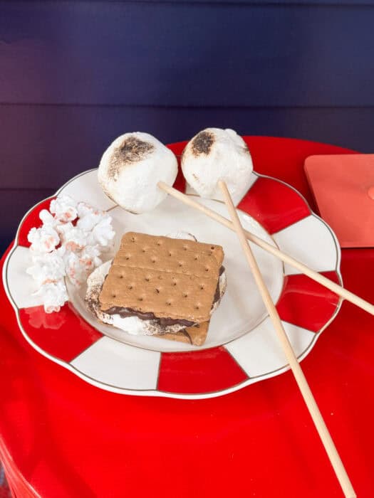
Natalee specializes in the most absurdly realistic fake food, and she sent me a summer treat plate that stopped every single person who walked onto the porch in their tracks. S’mores. Toasted marshmallows on sticks. A little cluster of popcorn. On a red-and-white striped scalloped plate, sitting on the red garden stool side table. It is the kind of thing that makes people lean in for a closer look before they realize what they are seeing.
[Links: Annie Selke polka dot pillow, Headley House fake food
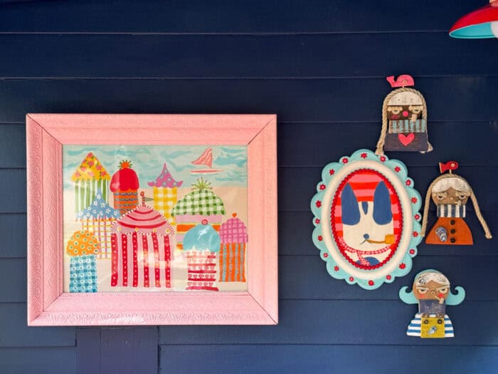
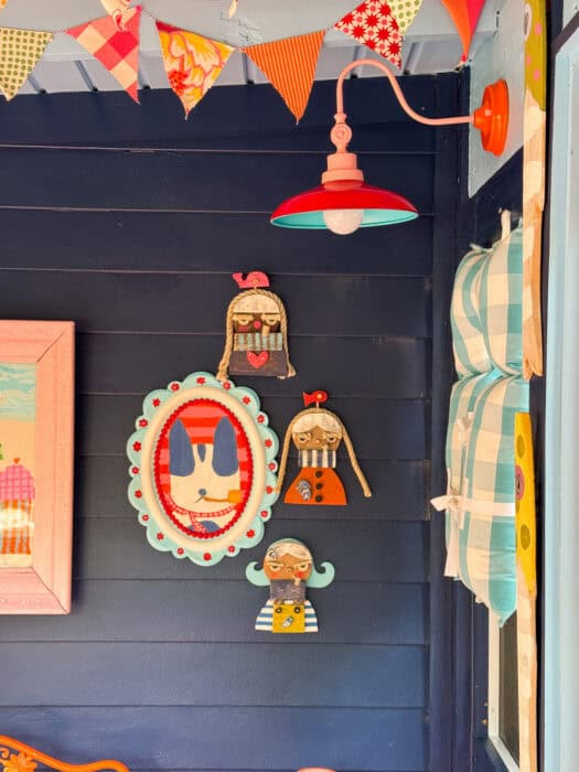
The Sea Hags (Yes, You Read That Right)
I found Sea Hag Studios last summer when I needed a sailor for my outhouse and it was all over for me.
She make these extraordinary little figures from driftwood — part folk art, part whimsy, part something I cannot quite describe except to say that my porch needed them immediately. Each one has a rope-yarn face and layers of painted wood and so much personality.
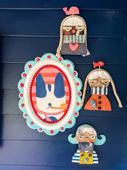
And then I had an idea. I commissioned one as Maui, my dog — painted as a sea hag, complete with a pipe. Because of course I did.
The three of them hang on the navy wall alongside a framed oval portrait of Maui (painted by me, in my best impressionist-dog style, set in a teal scalloped frame with red bead detail). It is the gallery wall of my dreams.
Link: Sea Hag Studios
The Pink Frame and the Cabana Painting
I found an antique frame at a local shop here at the cabin and painted it pink. Then I painted a new cabana painting to go inside it — all bright colors and beach-town joy…protected behind glass. It hangs on the navy wall and makes the whole area feel like a postcard from somewhere wonderful.
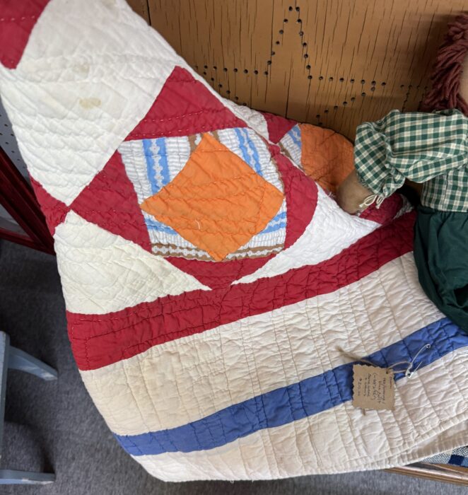
The Table, the Quilt Tablecloth, and the Green Chairs
The big table has lived on this porch for the past two summers. I did not replace it — I just gave it a new life. I draped an antique quilt I found at a shop here over it as a tablecloth. Pink-and-white stripes with a soft, worn texture that makes the whole table feel like a place you want to linger. My little felt birdhouse hangs above it.
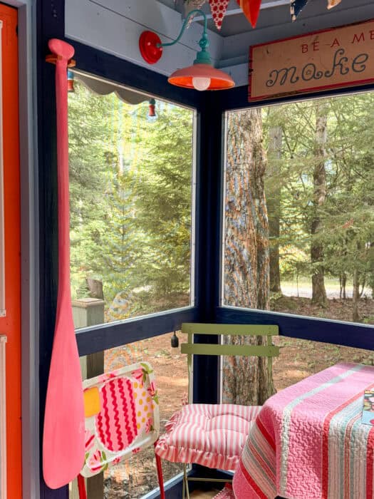
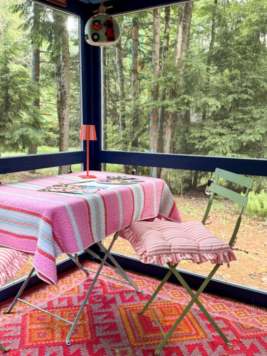 The two green metal folding chairs have also been around a while. But I added a ruffled cushion in pink-and-white stripe to each one, and suddenly they feel dressed up and ready for company.
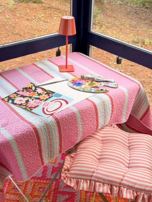
An orange cordless lamp lives on the table now — bright enough for evening painting sessions, cheerful enough to make the whole space feel festive even in the daytime.
The Pink Canoe Paddle
My husband hand-carved a canoe paddle for me — I painted it pink, of course — and it hangs on the wall near the door. It is one of those details that makes people smile before they even know why.
Once I had the paddle up, I knew I needed a life vest nearby. I found the perfect one from Norpine Home Decor: a blue gingham life vest with white ribbon ties. It hangs in the screened window between the porch door and the wall, and it is exactly as charming as it sounds.
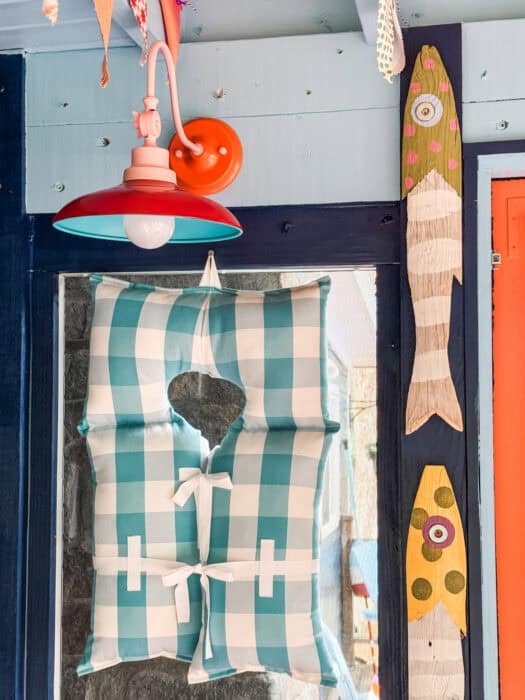
A few summers ago, I found a pair of painted fish made from old fence posts in Maine. They have traveled with me ever since, waiting for the right wall. This is the right wall. They hang near the gooseneck lights and bring a little coastal quirkiness to the nautical theme.
Link: Norpine Home Decor life vest
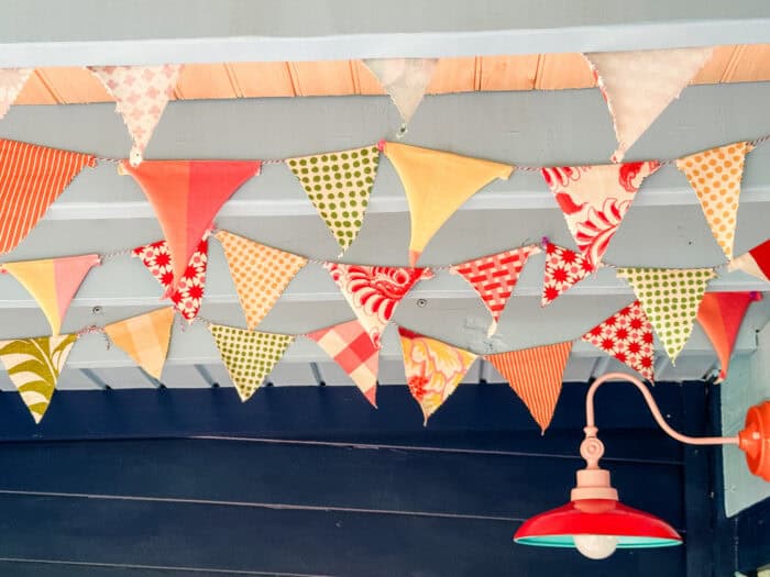
The Lights (and the Best Etsy Story)
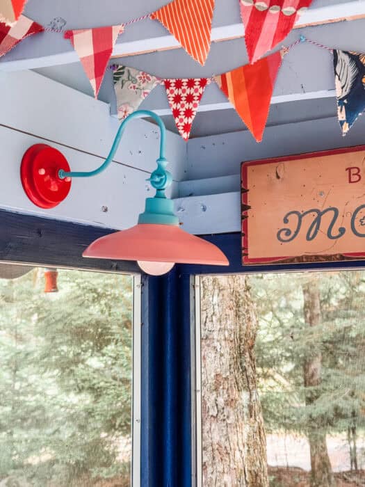
The porch is not wired. No outlets, no overhead fixtures — just a beautiful space that went dark the moment the sun went down. So I went hunting for a solution.
I found a seller on Etsy who makes gooseneck barn lights with rechargeable bulbs. No wiring needed (but the lights are wired if you desire that). And the light they put out? Incredible. Bright, warm, exactly what I wanted.
But here is the best part of this whole project.
When I reached out to place my order, I realized the seller was my children’s elementary school art teacher. The one all the kids loved. The one who lit up a classroom for years. She custom-painted my lights in four colors — the pink-and-orange combination you see on the gooseneck arms, the red shades, the teal interiors — and we had the most wonderful reunion over Etsy messages.
Sometimes the internet gives you something genuinely good.
Link: Etsy gooseneck lights
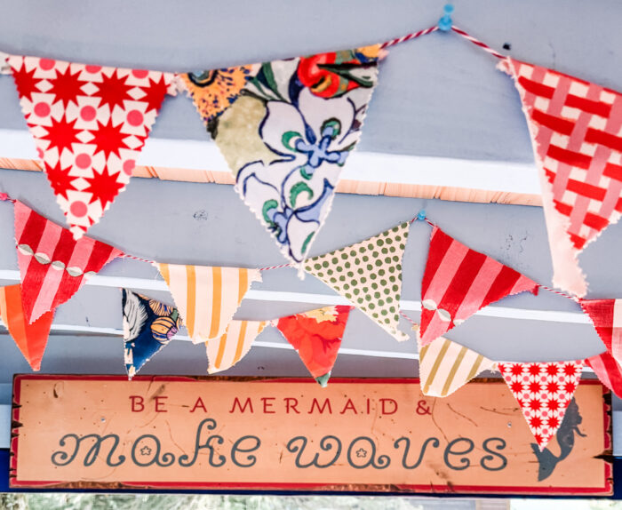
The “Be a Mermaid” Sign
The wall above the table needed something. I found a seller on Etsy who makes a painted wooden sign that reads: “Be a mermaid and make waves.” I had never seen that one before, and something about it felt exactly right for this space — a little salty, a little dreamy, a little bit the energy I want every time I walk out here.
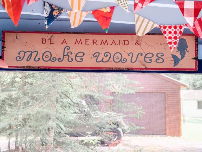
Link: Etsy mermaid sign
The Bunting
I made the bunting banners myself from fabric scraps left over from chair projects — all the patterns and colors that already live in my world. Florals, stripes, gingham, dots, graphic prints. I strung them from the ceiling beams, and they are possibly the most me thing in the entire space.
The Sign That Started as a Joke (But Wasn’t)
I found an old crib headboard at a local antique shop and knew immediately it needed to become a sign. The shape was too good to pass up — all curves and charm, just waiting for paint.
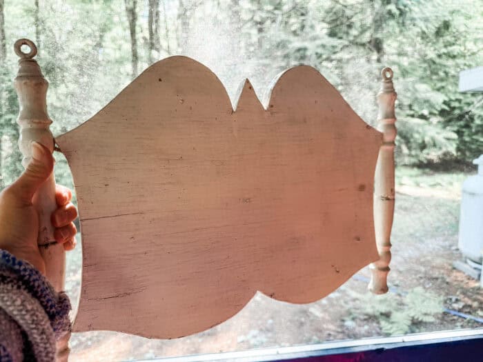
I did not know what it would say yet. So I asked my followers.
One of them came back with “Screen Time” and I laughed out loud, then immediately picked up a brush. For a screened-in porch, it is the perfect pun — a little cheeky, a little self-aware, and completely on brand for a space that has become my daily retreat from everything that actually requires a screen.
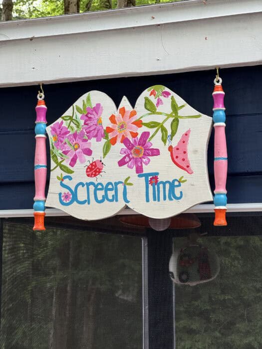
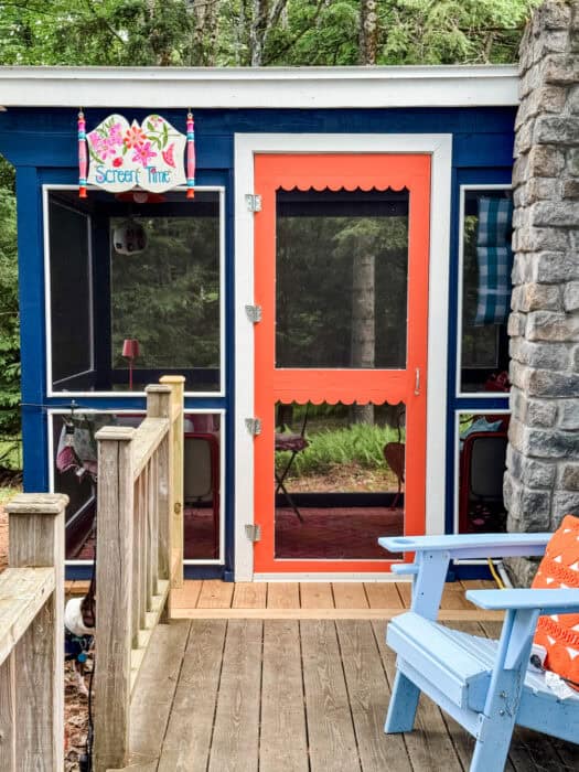
I painted it with florals and hung it outside above the door, right where everyone sees it first when they walk up. It greets you before you even step inside.
Honestly, it might be my favorite thing out there.
What This Porch Taught Me About Color
I had people tell me that orange, red, and blue together would be too much. Too loud. Too hard to make work.
But here is what I know about color: it is almost never too much when it comes from a place of intention. When you start with an anchor — in this case, a quilt in an antique store in April — and let everything else respond to that, the palette finds its own logic.
Pink came in naturally, the way it always does in my spaces. The navy made the brights pop instead of competing. The orange warmed the whole thing up and kept it from feeling cold or coastal-cliche.
The porch is loud. It is joyful. It is exactly what I needed it to be.
Sources

Check out my online courses to spark your creativity and upgrade your joy, starting today!


10 Best Statement-Making Fabrics from Spoonflower