How to Upholster Like a Pro
Have you ever wondered how upholsterers achieve beautiful works of art on chairs? It’s not an accident when upholstery turns out beautifully, I can guarantee that! It takes thoughtful consideration when working with printed fabrics, especially when it involves a set of chairs. Should the prints match exactly or show different aspects of the print? What color do you paint the chairs, if they need painting? And what style(s) work best for a particular room? When a client comes to me looking for a set of chairs for their dining room, there are a few consecutive steps that I take to give them the set of their dreams.
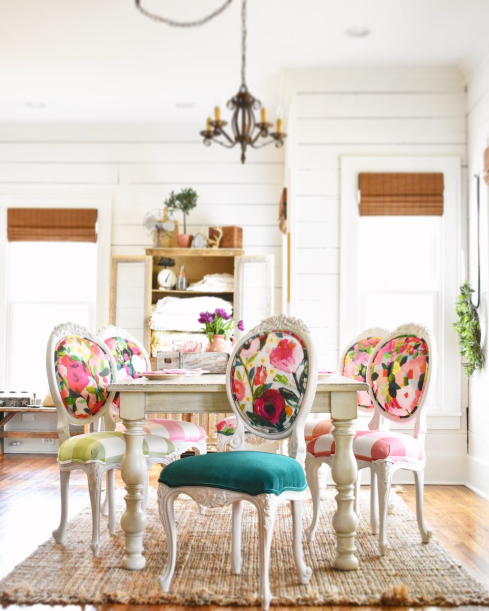
First, I ask them what style they like. Some clients want curvy French chairs, others prefer classic round Louis chairs, and a few select Victorian chairs. Sometimes I have these chairs on hand and other times I have to hunt down a set. If I can’t find a perfect set, we talk about mixing different chairs together to make a set. This set is one example of that. The side chairs don’t exactly match the arm chairs, but that’s not a problem. They have a basic curvy look and with the same paint and fabric, they look like a set.
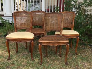
Next, we talk fabric. I look at pictures of their space to determine which colors would bring out the best in their space. I find out what kinds of prints they love…geometric, floral, solid velvets, cowhides, etc. Then I go to work hunting down that perfect fabric.
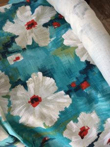
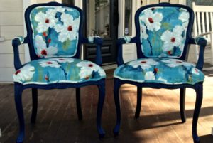
The fabric always determines the paint! On this set of chairs, the client and I brainstormed several colors before determining that navy would be the right choice. The red/orange would be too bold and would really take away from the dynamic splash of color in the fabric. Cream/white would be okay, but nothing special. We might be able to get away with green, but turquoise would be too much—it’s already so prevalent in the fabric. Yes, navy is the right choice because it allows the turquoise and red to pop and be the “show” on this pretty print.
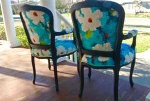
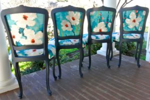
Once the chairs are painted, the art of fabric placement is the most important part of upholstery. The top of the chairs gets the most consideration primarily because it is what is noticed. Notice how I did not center the flower on any of the fronts of the chairs. I planned to mix it up on purpose and wanted it to look more like art. 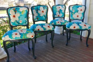
Even on the backsides I implemented this philosophy. Some flowers peek in from the bottom, one is centered, and the others take on other positions. Now, the bottoms of the chairs are another story…this fabric is expensive. Since we could not afford to waste any of it, the seats of the chairs don’t get a mix of patterns.
So, if you want to upholster like a pro, follow these basic steps: select paint based on a minor color within the fabric. This allows the beauty of the print to take center stage. Then, be strategic when deciding how to place the fabric on the chairs. Either make the prints match exactly with placement or mix all of them up—you can’t go wrong either way. Finally, step back and enjoy your work of art. You’ve upholstered just like a pro!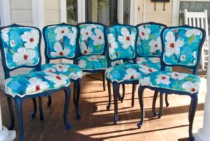

Check out my online courses to spark your creativity and upgrade your joy, starting today!


10 Best Statement-Making Fabrics from Spoonflower